Experience & User Engagement focuses on how to apply Voice & Tone Design in Microcopy.
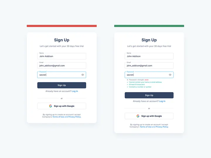
Registration Forms
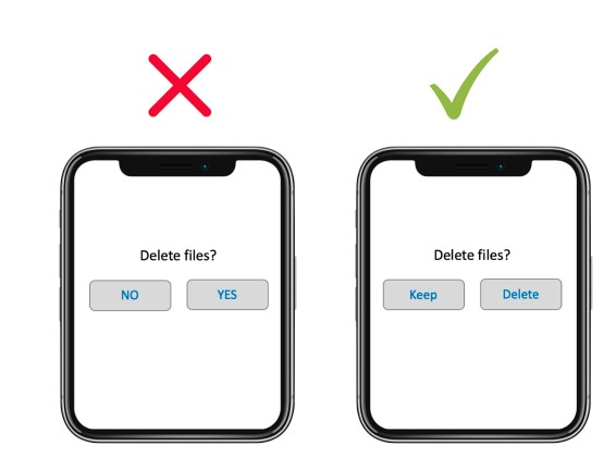
- Avoid words like “user”, “new user”, “existing user”, “login for registered users”, etc. Instead, speak to users directly and welcome them.
- Explain the advantages of a registration, e.g., “faster checkout process”, “enter your data only once”, “financial advantages for registered customers”, “track orders, deliveries and your order history”, etc.
- Remove worries / obstacles. People usually don’t want to register anywhere because it takes time and effort to fill out forms, they don’t want to give out email adresses and / or they are worried there will be hidden costs that apply at a later time. Assure them, offer registration via services that are likely already in use, e.g. register using google or social media account.
Tip
- Use “sign-up” instead of “register” as it suggests a shorter, easier process.
- Provide instant input validation, e.g., for passwords.
- Allow switching between login and sign-up
Example
Examples for registration form titles:
- Not registered yet? Then this is the right place for you.
- Nice to get to know you :)
- Register now and start… (editing images, connecting with firends, etc.)
- New here?
- Let me in!
- Not a member yet?
Newsletters
Newsletter invitation are usually divided in 3 categories:
- Boring (e.g., “Subscribe to our newsletter!”, “To subscribe to our newsletter, enter your data here”)
- We-keep-you-up-to-date (e.g., “don’t miss out on new articles”, “get to know more about new products and sales”)
- Convincing
Newsletter invitations work the same way sales discussions do. Provide a legit reason or a value to make users subscribe to a newsletter)
- Choose a fitting title
- Explain what users gain when they subscribe to the newsletter
- Remove worries / obstacles (e.g., assure users that newsletters are send out at a low frequency and that their email addresses are secured, because you care about data security)
Error Messages
- Explain in simple terms that there is a problem and what the problem is
- Suggest a solution so that users can return to the process and finish it
- (Try to) turn the delay into a pleasant experience
Exception: standart errors like a wrong password do not require both explanation and solution as users are likely already familiar with those.
To write a good error message, you need to know the followign information:
- What was the user trying to do when the error occured?
- Why did the error occur?
- What can the user do to continue with the process?
- If there is no solution, can you offer an alternative action?
Caution
The more general the error message is, the less helpful it is.
When writing error messages, make sure to be actionable and compassionate.
| Characteristic | Description |
|---|---|
| Actionable | Does the error say what happened in simple terms and explain what the user needs to do next to get back on task? |
| Compassionate | Do the language and the tone of the message match the severity of the issue and avoid blaming the user for the error? |
Success Messages
Goals of a success message:
- Assure users
- Instruct users
- Connect with users
Components of a good success message:
- Address your users instead of the action
- Make sure that the user knows that what they were trying to do was successful
- If relevant, take up a meaningful aspect of the action (e.g., if a user subscribes to a newsletter, remind them that it will be available in their inbox soon)
- Present the next step and motivate users
Note
Typical scenarios for success messages:
- Sign-up to a website, community, event or service
- Purchase of a product or service
- Subscription to a newsletter
- Log out
- Sending a contact form
- Import / Export of data or files
- Email verification
- Password recovery
Placeholders
Placeholders are texts within an input field (usually in a lighter color) that are overwritten once the user enters an actual input text. They are not to be confused with labels (the name of the input fields).
- Only use placeholders if necessary (if the label is self-explanatory, there is no need for a placeholder)
- Use placeholders in input fields users are actually expected to fill out
- Use placeholders for input fields that are hard to understand
- Do not use placeholders for instructions
Types of placeholders:
- Questions (e.g., “Where are you traveling?” on booking websites, “What are you looking for?” in search bars, etc.)
- Categories (e.g., “destination, hotel name, airport, attraction or address” on booking websites, “job title, qualification or company” in search bars of a job portal)
- Examples for input text
- Guidelines (e.g., “Show us that you are the right person for this job” in an input field for a cover letter in a job portal)
- Remove obstacles (e.g., a combination of examples to make sure users know what input is expected)
- Having fun (e.g., “knechtruprecht@groening.742” in an input field for an email address)
Buttons
Just focus on the value of an action instead of the action.
Note
Not every button has an important value. Invest your time in relevant buttons, e.g., registration, download, etc.
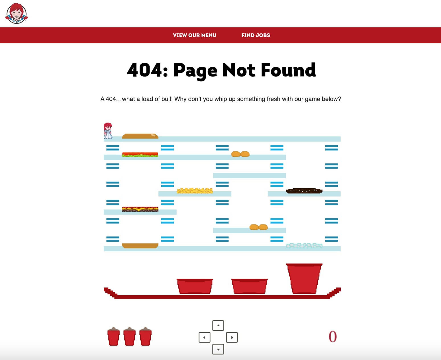
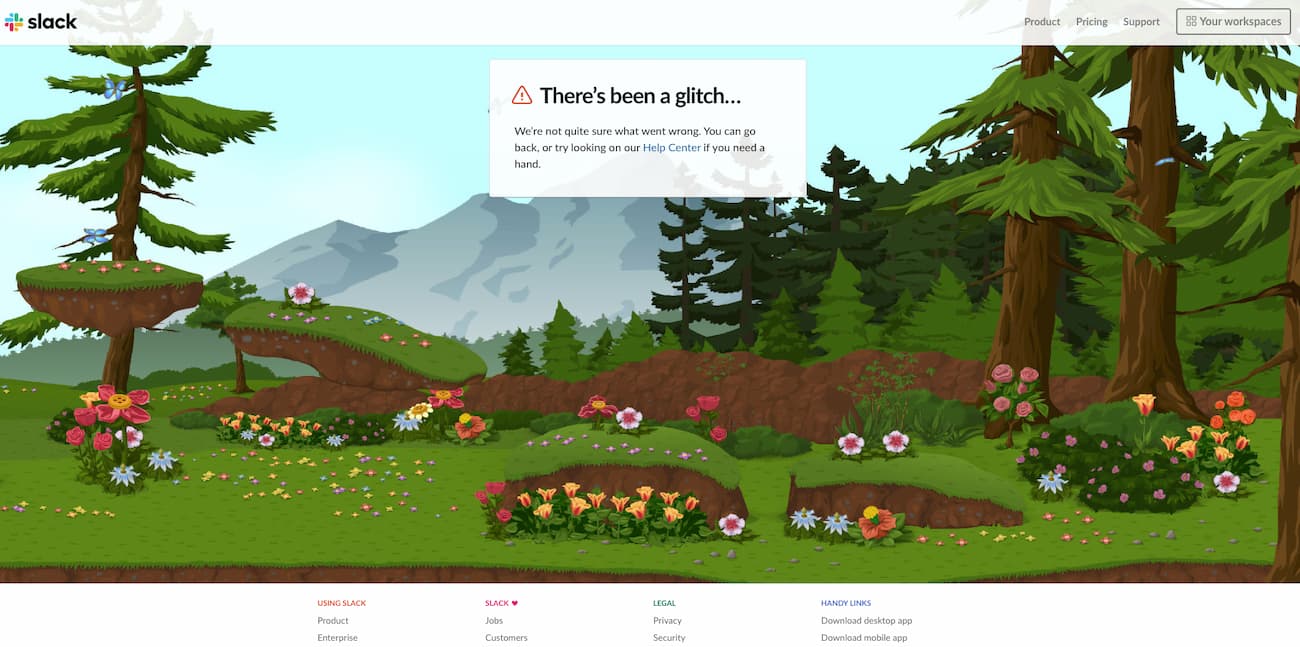
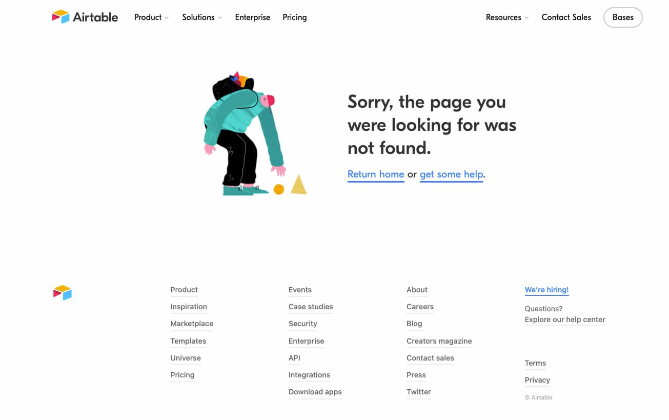
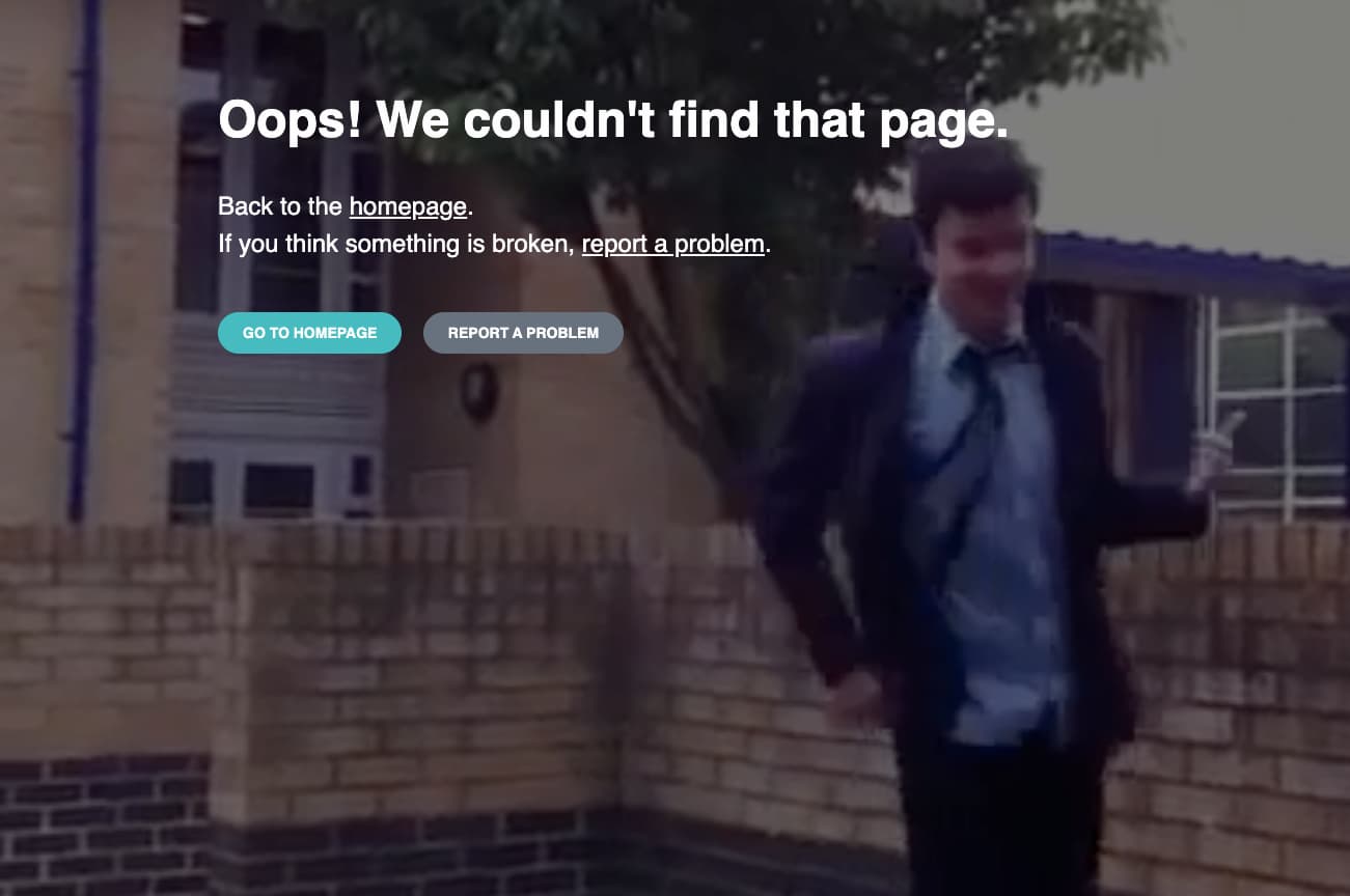
404 Errors
The default message: 404 - Page not found
Rules for good 404 pages:
- Explain what happened und how the user got there
- Be compassionate (users might be disappointed not to find what they were looking for)
- Show them an exit (e.g., links to a central part of the website, a search bar, etc.)
- Add a link to the homepage
- If the 404 page contains the main menu, make sure users know that they can use it to get back on track
Misc
The following scenarios might be added in the future:
- Contact
- Empty States
- Waiting Time